ROC, Paper, Scissor, Shoe
By Ken Koon Wong in r R roc auc brier calibration dca decision curve analysis
September 2, 2026
📊 Working through ROC-AUC from scratch, then poking at its blind spots — low prevalence, calibration, and finally Decision Curve Analysis. Mostly notes to myself on what I learned (and got confused by) along the way. 🤔📈
Motivations
We see ROC-AUC so often with classification models, we know the higher the better, but there is always that, well it depends scenario. I’ve always wanted to know what the pitfall is, how to avoid it, and how to do better. Let’s go from the basics on how to code ROC-AUC from scratch to decision curve analysis!
Objectives:
- What is ROC, why we use it?
- How To Calculate ROC from Scratch?
- Pitfall of ROC-AUC
- Decision Curve Analysis
- Opportunities For Improvement
- Lessons Learnt
What is ROC, Why We Use It
Receiver Operating Characteristic (ROC) Curve is a plot that shows the performance of a binary classification model. The y-axis consists of Sensitivity (True positive rate), and the x-axis consists of 1 - Specificity (aka false positive rate). ROC curve is obtained as the cdf of the detection probability in the y-axis vs the cdf of x-axis (false positivity rate). It was first developed by electrical and radar engineers during World War II for detecting enemy objects in battlefields, starting in 1941, which led to its name. Since then it has been widely introduced to other fields. This tool is used for its convenience, interpretability and also models comparison, hence the wide adoption of this metric.
wiki link. Alright, enough of the history, let’s move on to the next section.
How To Calculate ROC from Scratch
Simulate Data
library(tidyverse)

set.seed(1)
n_neg <- 15
n_pos <- 15
score_neg <- rnorm(n_neg, mean = 3, sd = 1)
score_pos <- rnorm(n_pos, mean = 5, sd = 1)
df <- tibble(
  y_true  = c(rep(0, n_neg), rep(1, n_pos)),
  y_score = c(score_neg, score_pos))
Procedure for ROC
Step 1: Sort the predicted scores in descending order and assign a threshold for each unique score.
threshold_vec <- df |> arrange(desc(y_score)) |> pull(y_score)
Step 2: For each threshold, calculate the True Positive Rate (TPR) and False Positive Rate (FPR).
# we'll use for loop here for better understanding
true_pos_vec <- false_pos_vec <- vector(mode = "numeric", length = length(threshold_vec))

for (i in 1:length(threshold_vec)) {
  tp_sum <- 0
  fp_sum <- 0
  for (j in 1:nrow(df)) {
    y_true_j <- df[[j, "y_true"]]
    y_score_j <- df[[j, "y_score"]]
    if (y_score_j >= threshold_vec[i] & y_true_j == 1) { tp_sum <- tp_sum + 1 }
    if (y_score_j >= threshold_vec[i] & y_true_j == 0) { fp_sum <- fp_sum + 1 }
  }
  true_pos_vec[i] <- tp_sum
  false_pos_vec[i] <- fp_sum
}

df_auc <- df |>
  arrange(desc(y_score)) |>
  mutate(tp = true_pos_vec,
         fp = false_pos_vec,
         fn = sum(y_true == 1) - tp,
         tn = sum(y_true == 0) - fp,
         tpr = tp / (tp + fn),
         fpr = fp / (fp + tn))

df_auc |>
  ggplot(aes(x = fpr, y = tpr)) +
  geom_point() +
  geom_line() +
  theme_bw()
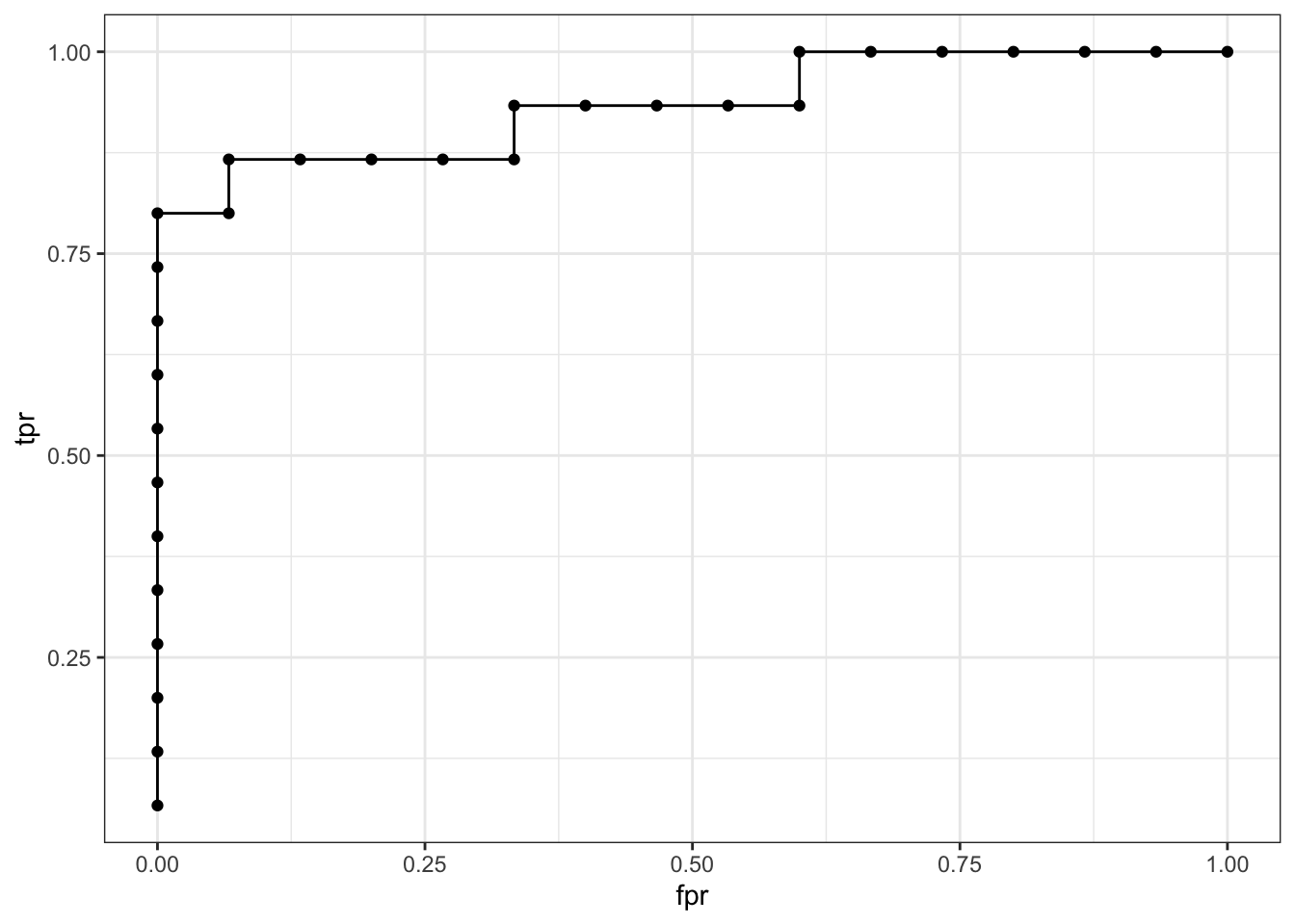
Alright, the above is just a for loop that looks at all of the predicted scores and calculates the true positive rate and false positive rate for each threshold. The ROC curve is then plotted using ggplot2. Now let’s add up all the rectangles to calculate ROC-AUC.
df_auc |>
  mutate(test = abs(lag(fpr, default = 0) - fpr),
         area = test * tpr) |>
  mutate(auc = sum(area)) |>
  distinct(auc) |>
  pull()
## [1] 0.9333333
Woo hoo! ROC-AUC is 0.93! Awesome!
OK, so what if we were able to calculate ROC-AUC? Is it a good metric to evaluate model performance? In comes Youden-J index, which is a metric that is used to find the optimal threshold for a binary classification model. It is defined as Youden-J = Sensitivity + Specificity - 1. The optimal threshold is the one that maximizes Youden-J. Let’s calculate it along with sens, spec, ppv, and npv.
df_optimal <- df_auc |>
  mutate(
    spec = 1 - fpr,
    ppv = tp / (tp + fp),
    npv = tn / (tn + fn),
    J = tpr + spec - 1) |>
  arrange(desc(J)) |>
  head(1)

print(paste0("J: ", df_optimal$J, "; sensitivity: ", df_optimal$tpr |> round(2), "; specificity: ", df_optimal$spec |> round(2), "; ppv: ", df_optimal$ppv |> round(2), "; npv: ",df_optimal$npv |> round(2)))
## [1] "J: 0.8; sensitivity: 0.8; specificity: 1; ppv: 1; npv: 0.83"
Alright! Looks pretty good! We have nice looking ROC-AUC along with nice looking ppv and npv! lol, yes “nice looking” is an official statistical term 🤣 Now that we have seen the ROC-AUC and Youden-J index, let’s simulate a scenario where we have low prevalence and low sample size to see how it affects the ROC-AUC and Youden-J index.
Pitfall of ROC-AUC
Simulate Low Prevalence
We’re going to set n_neg to 99 and n_pos to 1, with the same code as above. Let’s look at the curve, AUC, and the metrics
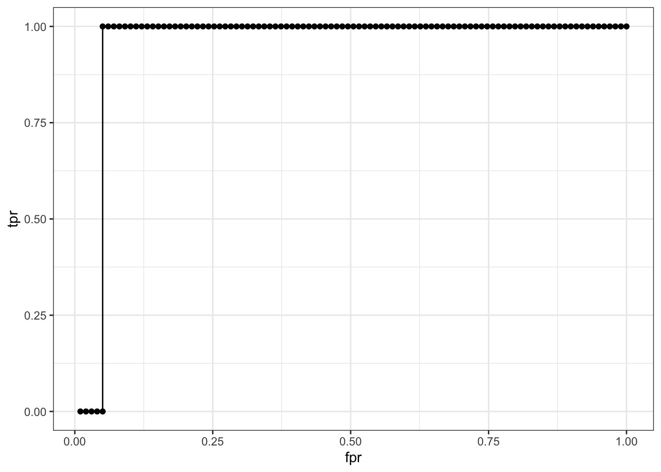
## [1] "ROC-AUC: 0.94949494949495"
## [1] "J: 0.95; sensitivity: 1; specificity: 0.95; ppv: 0.17; npv: 1"
Holy cow, notice how great AUC, sens, and spec are but look at ppv! Do we want a test like that and have a bunch of false positives? I don’t think so. This is a classic example of how ROC-AUC can be misleading in low prevalence scenarios.
Miscalibration
Now, let’s look at another scenario where we have a well-calibrated model, a biased model, an overconfident model, and an underconfident model. We’ll simulate 3000 samples and look at the ROC-AUC and calibration curves.
code
library(tidyverse)

set.seed(1)
n <- 3000
true_logit <- rnorm(n)
true_prob  <- plogis(true_logit)
y_true     <- rbinom(n, 1, true_prob)

df <- tibble(y_true, true_logit) |>
  mutate(
    pred_wellcal    = plogis(true_logit),           # reference: correct
    pred_biased     = plogis(true_logit + 1.0),      # intercept shift -> BIAS
    pred_overconf   = plogis(true_logit * 3),        # slope shrink -> MISCALIBRATION
    pred_underconf  = plogis(true_logit * 0.4)       # slope stretch -> MISCALIBRATION
  )

library(pROC)

roc_wellcal   <- roc(df$y_true, df$pred_wellcal,   quiet = TRUE)
roc_biased    <- roc(df$y_true, df$pred_biased,    quiet = TRUE)
roc_overconf  <- roc(df$y_true, df$pred_overconf,  quiet = TRUE)
roc_underconf <- roc(df$y_true, df$pred_underconf, quiet = TRUE)

tibble(
  model = c("wellcal", "biased", "overconf", "underconf"),
  auc   = c(auc(roc_wellcal), auc(roc_biased), auc(roc_overconf), auc(roc_underconf))
)
## # A tibble: 4 × 2
##   model       auc
##   <chr>     <dbl>
## 1 wellcal   0.740
## 2 biased    0.740
## 3 overconf  0.740
## 4 underconf 0.740
ggroc(list(wellcal = roc_wellcal, biased = roc_biased,
           overconf = roc_overconf, underconf = roc_underconf)) +
  theme_bw() +
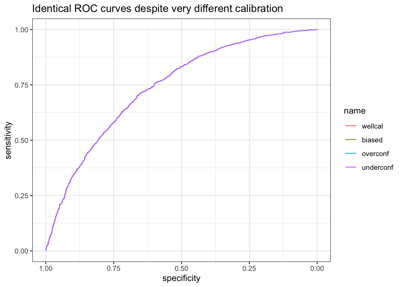
  labs(title = "Identical ROC curves despite very different calibration")
## # A tibble: 4 × 2
##   model       auc
##   <chr>     <dbl>
## 1 wellcal   0.740
## 2 biased    0.740
## 3 overconf  0.740
## 4 underconf 0.740
Notice how a point estimate of ROC-AUC and the curve hide the fact that the models are very different in terms of calibration. Let’s look at the calibration curves for each model.
Interesting note that I didn’t know bias is a shift in the intercept and miscalibration is a shift in the slope. I always thought they’re all bias.
code
calibration_data <- function(pred, y, model_name, n_bins = 10) {
  tibble(pred = pred, y = y) |>
    mutate(bin = ntile(pred, n_bins)) |>
    group_by(bin) |>
    summarise(
      mean_pred = mean(pred),
      observed_rate = mean(y),
      n = n(), .groups = "drop") |>
    mutate(model = model_name)
}

cal_df <- bind_rows(
  calibration_data(df$pred_wellcal,   df$y_true, "wellcal"),
  calibration_data(df$pred_biased,    df$y_true, "biased"),
  calibration_data(df$pred_overconf,  df$y_true, "overconf"),
  calibration_data(df$pred_underconf, df$y_true, "underconf")
)

cal_df |>
  ggplot(aes(x = mean_pred, y = observed_rate, color = model)) +
  geom_point(size = 2) +
  geom_line() +
  geom_abline(slope = 1, intercept = 0, linetype = "dashed", color = "gray40") +
  coord_equal(xlim = c(0,1), ylim = c(0,1)) +
  labs(x = "Mean predicted probability", y = "Observed event rate",
       title = "Same ROC-AUC, four very different calibration curves") +
  theme_bw()
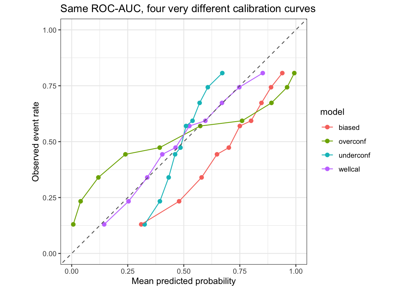
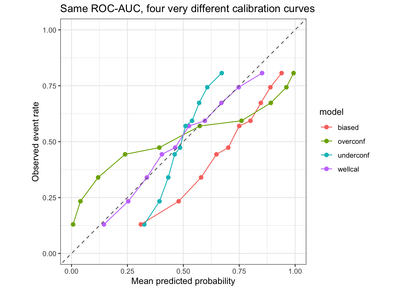
Very quickly, a visual heuristic of looking at calibration curve is you want your model’s prediction frequency on average to be close to the observed frequency. If your model is overconfident, it will be above the diagonal line, and if your model is underconfident, it will be below the diagonal line. If your model is biased, it will be shifted to the left or right of the diagonal line. How we get here is by binning the predicted probabilities into 10 bins and then calculate the mean predicted probability and the mean observed event rate for each bin. A well-calibrated model will have the mean predicted probability close to the mean observed event rate for each bin.
A quick visual of the above, you see that the well-calibrated model is close to the diagonal line, the biased model is shifted to the right (only intercept changed), the overconfident model is above the diagonal line (slope reduced), and the underconfident model is below the diagonal line (slope increased).
Let’s see if we can fit a logistic regression model to see if we can quantify the calibration of each model. We will fit a logistic regression model with the predicted probabilities as the independent variable and the true labels as the dependent variable. The intercept and slope of the fitted model will give us an idea of how well-calibrated the model is.
Note to self: Apparently this is called Cox calibration, which is a method to assess the calibration of a model by fitting a logistic regression model with the predicted probabilities as the independent variable and the true labels as the dependent variable. The intercept and slope of the fitted model will give us an idea of how well-calibrated the model is. A well-calibrated model will have an intercept close to 0 and a slope close to 1. A biased model will have an intercept that is not close to 0, and a miscalibrated model will have a slope that is not close to 1.
code
cox_calib <- function(y, p) {
  logit_p <- qlogis(pmin(pmax(p, 1e-6), 1 - 1e-6))
  fit <- glm(y ~ logit_p, family = binomial)
  tibble(intercept_a = coef(fit)[1], slope_b = coef(fit)[2])
}

bind_rows(
  wellcal   = cox_calib(df$y_true, df$pred_wellcal),
  biased    = cox_calib(df$y_true, df$pred_biased),
  overconf  = cox_calib(df$y_true, df$pred_overconf),
  underconf = cox_calib(df$y_true, df$pred_underconf),
  .id = "model"
)
## # A tibble: 4 × 3
##   model     intercept_a slope_b
##   <chr>           <dbl>   <dbl>
## 1 wellcal       0.00597   0.958
## 2 biased       -0.952     0.958
## 3 overconf      0.00597   0.319
## 4 underconf     0.00597   2.39
## # A tibble: 4 × 3
##   model     intercept_a slope_b
##   <chr>           <dbl>   <dbl>
## 1 wellcal       0.00597   0.958
## 2 biased       -0.952     0.958
## 3 overconf      0.00597   0.319
## 4 underconf     0.00597   2.39
Look at that! Here is another interesting bit, notice how the slope for over and under confident model is reciprocal of the “simulated” (ok not really simulated, more like specified miscalibration) from the data we generated? If we dwell on the thought process of it, it makes sense, because for overconfident model, the way we miscalibrated is by multipling 3x to the logit and then we simulate it with binomial distribution. So we’re pushing the logits closer to positive and negative infinity which makes the predicted probabilities closer to 0 and 1. When we fit a logistic regression model to the predicted probabilities and the true labels, we’re essentially trying to find the best fit line that maps the predicted probabilities to the true labels. Since the predicted probabilities are pushed closer to 0 and 1, the slope of the fitted line will be less than 1, which is what we see in the output. Similarly, for the underconfident model, we’re pushing the logits closer to 0, which makes the predicted probabilities closer to 0.5. When we fit a logistic regression model to the predicted probabilities and the true labels, we’re essentially trying to find the best fit line that maps the predicted probabilities to the true labels. Since the predicted probabilities are pushed closer to 0.5, the slope of the fitted line will be greater than 1, which is what we see in the output. Let’s visualize the logit lines and the curves
code
plot_line <- function(df = df, pred_col, model_name) {

  form <- as.formula(paste0("y_true ~ qlogis(", pred_col, ")"))
  model <- glm(form, data = df, family = binomial)

  df <- df |>
    mutate(
      pred_logit_x = qlogis(.data[[pred_col]]),
      pred_logit_y = predict(model, newdata = df, type = "link")
    )

  df |>
    ggplot(aes(x = pred_logit_x, y = pred_logit_y)) +
    geom_point() +
    geom_line(color = "blue", linewidth = 1) +
    geom_abline(slope = 1, intercept = 0, linetype = "dashed", color = "gray40") +
    labs(title = paste("Calibration plot for", model_name),
         x = "Logit of predicted probability",
         y = "Logit of observed probability") +
    xlim(-2.5, 2.5) +
    ylim(-5, 5) +
    theme_bw()
}

library(patchwork)

p1 <- plot_line(df, "pred_wellcal",   "Well-calibrated Model")
p2 <- plot_line(df, "pred_biased",    "Biased Model")
p3 <- plot_line(df, "pred_overconf",  "Overconfident Model")
p4 <- plot_line(df, "pred_underconf", "Underconfident Model")

(p1 | p2) / (p3 | p4)
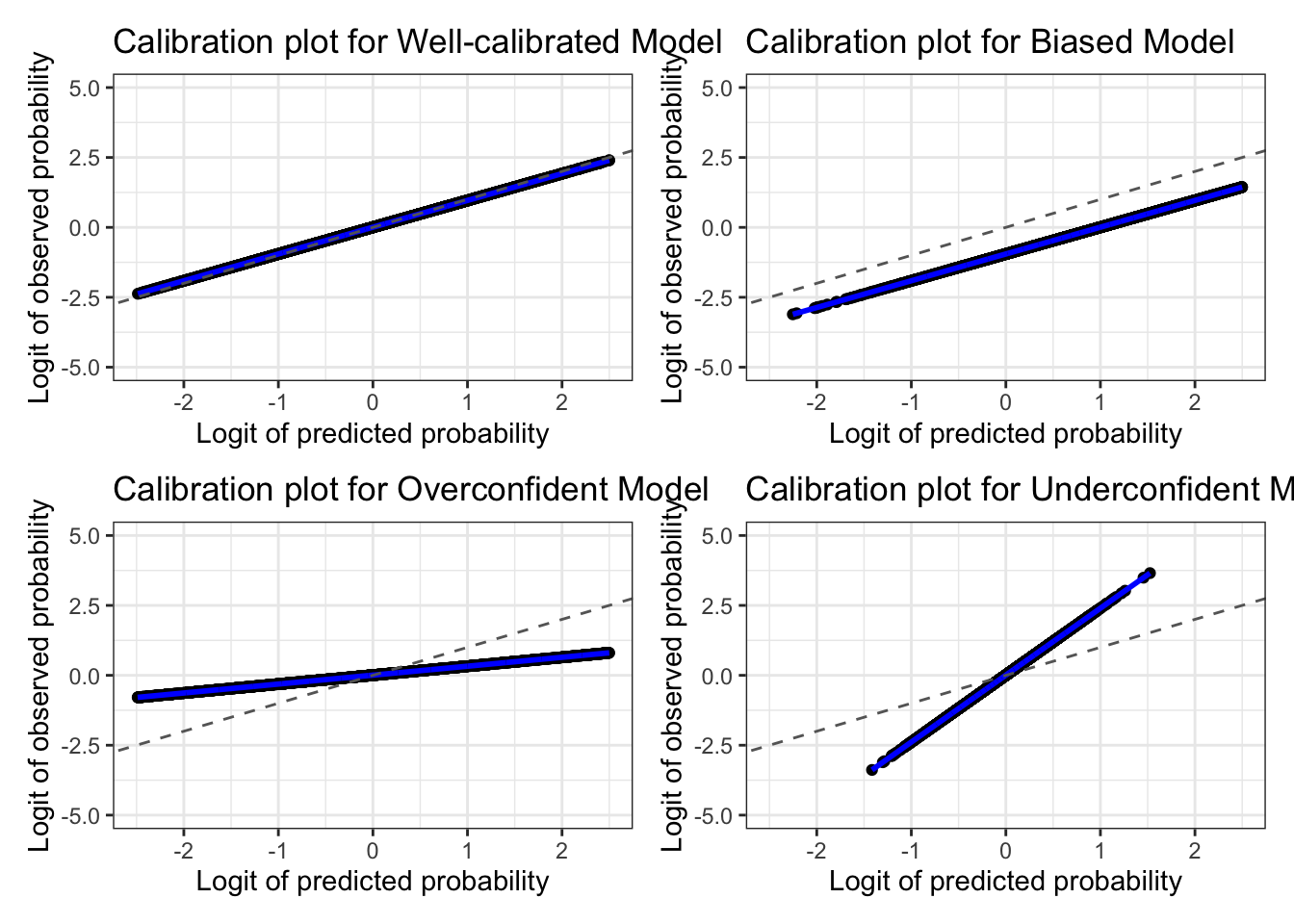
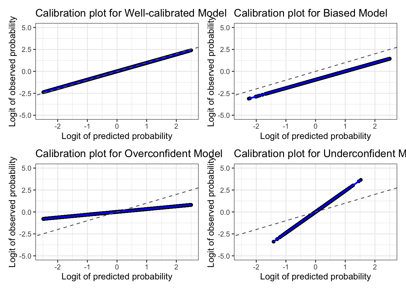
There you go! Let’s look at the curves
code
plot_line <- function(df = df, pred_col, model_name) {

  form <- as.formula(paste0("y_true ~ qlogis(", pred_col, ")"))
  model <- glm(form, data = df, family = binomial)

  plot_df <- df |>
    mutate(
      x_val = .data[[pred_col]],
      fitted_prob = predict(model, newdata = df, type = "response")
    )

  plot_df |>
    ggplot(aes(x = x_val)) +
    geom_point(aes(y = y_true),alpha=0.1) +
    geom_line(aes(y = fitted_prob), color = "blue", linewidth = 1) |>
      suppressWarnings() +
    geom_abline(slope = 1, intercept = 0, linetype = "dashed", color = "gray40") +
    labs(title = paste("Calibration curve for", model_name),
         x = paste0(pred_col, " (predicted probability)"),
         y = "P(y = 1)") +
    xlim(0,1) +
    theme_bw()
}


p1 <- plot_line(df, "pred_wellcal",   "Well-calibrated Model")
p2 <- plot_line(df, "pred_biased",    "Biased Model")
p3 <- plot_line(df, "pred_overconf",  "Overconfident Model")
p4 <- plot_line(df, "pred_underconf", "Underconfident Model")

(p1 | p2) / (p3 | p4)
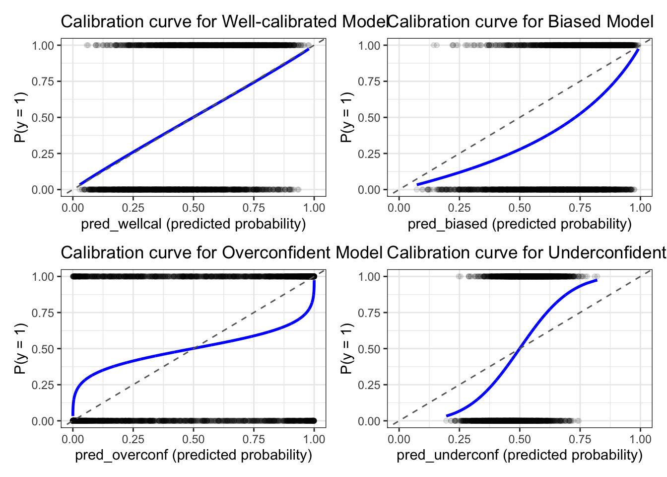
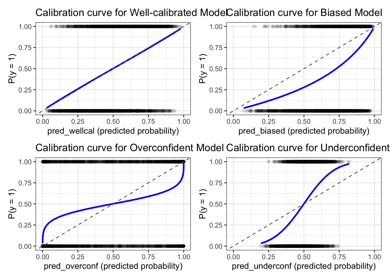
Wow, I don’t think I’ve visualized the curve before. This is interesting! Visualizing the calibration plot is very important to assess the calibration of a model. Now, let’s look at brier score = mean((p - y)^2) which is a metric that is used to assess the calibration of a model. The lower the brier score, the better the calibration of the model. Let’s calculate the brier score for each model.
code
## # A tibble: 4 × 2
##   model     brier
##   <chr>     <dbl>
## 1 wellcal   0.207
## 2 biased    0.245
## 3 overconf  0.237
## 4 underconf 0.219
## # A tibble: 4 × 2
##   model     brier
##   <chr>     <dbl>
## 1 wellcal   0.207
## 2 biased    0.245
## 3 overconf  0.237
## 4 underconf 0.219
The score itself is not very interpretable, but it is a good metric to compare different models. The lower the brier score, the better the calibration of the model.
Decision Curve Analysis
So far we’ve seen that ROC-AUC can be identical across models that are wildly different once you look at calibration. But there’s still a gap: even a perfect calibration plot doesn’t tell you whether using the model to make a decision is actually worth it. That’s what Decision Curve Analysis (DCA) is for.
The core idea: every prediction model implies a decision rule — “if predicted risk ≥ some threshold pt, act (treat/test/intervene).” Different thresholds represent different tolerances for false positives vs. false negatives. DCA calculates a net benefit at each threshold and compares your model against two naive strategies: treat everyone and treat no one. Net Benefit = True positive / n - (False positive / n) * (threshold / (1 - threshold))
Note to self: the threshold/(1-threshold) term is also known as exchange rate — expressed in “true-positive-equivalents per patient” — a net benefit of 0.30 means “using this strategy nets you the equivalent of 30 true cases correctly identified per 100 patients, after subtracting the harm-weighted cost of the false positives it also generates.” It’s not a percentage and it’s not meaningful in isolation — it only means something compared against another curve at the same threshold. It’s called true-positive-equivalent because it can either be additional true positive, or less false positive, or a combination of both.
Alright, let’s have Claude generate a simulation of non-linear DGP and see if tuned xgboost does better than logistic regression. We will assess the AUCs, calibration curve, brier score, and then we’ll DCA this thing comparing xgboost and LR.
Let’s assume that this is some model that predicts a condition which may need to receive some kind of intervention that is not too invasive or too costly.
code
library(tidyverse)
library(xgboost)
library(pROC)

set.seed(1)
n <- 3000

# ---- 1. Simulate nonlinear truth ----
x1 <- rnorm(n)
x2 <- rnorm(n)
true_logit <- 0.8*x1^2 - 1.2*x2 + 1.5*sin(x1*x2) - 0.5
true_prob  <- plogis(true_logit)
y_true     <- rbinom(n, 1, true_prob)

df <- tibble(y_true, x1, x2)

# ---- 2. Train/test split ----
idx <- sample(1:n, 0.7*n)
train <- df[idx, ]
test  <- df[-idx, ]

# ---- 3. Logistic regression (misspecified: linear terms only) ----
log_model <- glm(y_true ~ x1 + x2, data = train, family = binomial)
test$pred_logit <- predict(log_model, newdata = test, type = "response")

# ---- 4. Tuned XGBoost ----
dtrain <- xgb.DMatrix(as.matrix(train[, c("x1","x2")]), label = train$y_true)
dtest  <- xgb.DMatrix(as.matrix(test[,  c("x1","x2")]))

cv <- xgb.cv(
  params = list(objective = "binary:logistic",
                max_depth = 4, eta = 0.05, subsample = 0.8, colsample_bytree = 0.8),
  data = dtrain,
  nrounds = 500,
  nfold = 5,
  metrics = "logloss",
  early_stopping_rounds = 20,
  maximize = FALSE,
  verbose = 0
)
best_nrounds <- cv$best_iteration

# Fallback: manually find best round from the CV log if best_iteration is missing
best_nrounds <- cv$evaluation_log |>
  slice_min(test_logloss_mean, n = 1) |>
  pull(iter)

print(best_nrounds)
## [1] 110
xgb_model <- xgb.train(
  params = list(objective = "binary:logistic",
                max_depth = 4, eta = 0.05, subsample = 0.8, colsample_bytree = 0.8),
  data = dtrain,
  nrounds = best_nrounds,
  verbose = 0
)
test$pred_xgb <- predict(xgb_model, dtest)

# ---- 5. AUC ----
auc_tbl <- tibble(
  model = c("logistic", "xgboost"),
  auc = c(auc(roc(test$y_true, test$pred_logit, quiet = TRUE)),
          auc(roc(test$y_true, test$pred_xgb,   quiet = TRUE)))
)
print(auc_tbl)
## # A tibble: 2 × 2
##   model      auc
##   <chr>    <dbl>
## 1 logistic 0.710
## 2 xgboost  0.762
# ---- 6. Brier score ----
brier <- function(y, p) mean((p - y)^2)
brier_tbl <- tibble(
  model = c("logistic", "xgboost"),
  brier = c(brier(test$y_true, test$pred_logit), brier(test$y_true, test$pred_xgb))
)
print(brier_tbl)
## # A tibble: 2 × 2
##   model    brier
##   <chr>    <dbl>
## 1 logistic 0.216
## 2 xgboost  0.198
# ---- 7. Calibration slope (Cox) ----
cox_calib <- function(y, p) {
  lp <- qlogis(pmin(pmax(p, 1e-6), 1 - 1e-6))
  fit <- glm(y ~ lp, family = binomial)
  tibble(intercept_a = coef(fit)[1], slope_b = coef(fit)[2])
}
cox_tbl <- bind_rows(
  logistic = cox_calib(test$y_true, test$pred_logit),
  xgboost  = cox_calib(test$y_true, test$pred_xgb),
  .id = "model"
)
print(cox_tbl)
## # A tibble: 2 × 3
##   model    intercept_a slope_b
##   <chr>          <dbl>   <dbl>
## 1 logistic     -0.0142   0.860
## 2 xgboost      -0.0189   0.909
calibration_data <- function(pred, y, model_name, n_bins = 10) {
  tibble(pred = pred, y = y) |>
    mutate(bin = ntile(pred, n_bins)) |>
    group_by(bin) |>
    summarise(
      mean_pred = mean(pred),
      observed_rate = mean(y),
      n = n(), .groups = "drop") |>
    mutate(model = model_name)
}

cal_df <- bind_rows(
  calibration_data(test$pred_logit, test$y_true, "logistic"),
  calibration_data(test$pred_xgb,   test$y_true, "xgboost")
)

cal_df |>
  ggplot(aes(x = mean_pred, y = observed_rate, color = model)) +
  geom_point(size = 2) +
  geom_line() +
  geom_abline(slope = 1, intercept = 0, linetype = "dashed", color = "gray40") +
  coord_equal(xlim = c(0,1), ylim = c(0,1)) +
  labs(x = "Mean predicted probability", y = "Observed event rate",
       title = "Calibration: logistic vs tuned XGBoost (nonlinear truth)") +
  theme_bw()
# ---- 8. Decision curve analysis ----
net_benefit <- function(y, p, pt) {
  treat <- p >= pt
  tp <- sum(treat & y == 1); fp <- sum(treat & y == 0); n <- length(y)
  (tp/n) - (fp/n) * (pt/(1-pt))
}
thresholds <- seq(0.01, 0.7, by = 0.01)

dca_df <- tibble(pt = thresholds) |>
  mutate(
    nb_logistic  = map_dbl(pt, ~ net_benefit(test$y_true, test$pred_logit, .x)),
    nb_xgboost   = map_dbl(pt, ~ net_benefit(test$y_true, test$pred_xgb, .x)),
    nb_treatall  = mean(test$y_true) - (1 - mean(test$y_true)) * (pt/(1-pt)),
    nb_treatnone = 0
  )

dca_df |>
  pivot_longer(-pt, names_to = "strategy", values_to = "net_benefit") |>
  ggplot(aes(pt, net_benefit, color = strategy)) +
  geom_line(linewidth = 1) +
  coord_cartesian(ylim = c(-0.05, max(dca_df$nb_treatall, na.rm=TRUE) + 0.05)) +
  labs(x = "Threshold probability", y = "Net benefit",
       title = "DCA: nonlinear truth, logistic vs tuned XGBoost") +
  theme_bw()
AUC for both models
print(auc_tbl)
## # A tibble: 2 × 2
##   model      auc
##   <chr>    <dbl>
## 1 logistic 0.710
## 2 xgboost  0.762
Here our simulated data contains nonlinear relationships between the predictors and the outcome, so we expect XGBoost to outperform logistic regression. The AUC for logistic regression is 0.71, while the AUC for XGBoost is 0.762. This is a significant difference, and it shows that XGBoost is able to capture the nonlinear relationships in the data.
Brier Score
print(brier_tbl)
## # A tibble: 2 × 2
##   model    brier
##   <chr>    <dbl>
## 1 logistic 0.216
## 2 xgboost  0.198
As we looked at before, higher or same AUC doesn’t mean better. Let’s look at brier, a heuristic to assess calibration. This shows that XGBoost is better calibrated than logistic regression. Lower == better.
Cox calibration
Next let’s look at Cox calibration, which is a method to assess the calibration of a model by fitting a logistic regression model with the predicted probabilities as the independent variable and the true labels as the dependent variable. The intercept and slope of the fitted model will give us an idea of how well-calibrated the model is. A well-calibrated model will have an intercept close to 0 and a slope close to 1. A biased model will have an intercept that is not close to 0, and a miscalibrated model will have a slope that is not close to 1.
print(cox_tbl)
## # A tibble: 2 × 3
##   model    intercept_a slope_b
##   <chr>          <dbl>   <dbl>
## 1 logistic     -0.0142   0.860
## 2 xgboost      -0.0189   0.909
cal_df |>
  ggplot(aes(x = mean_pred, y = observed_rate, color = model)) +
  geom_point(size = 2) +
  geom_line() +
  geom_abline(slope = 1, intercept = 0, linetype = "dashed", color = "gray40") +
  coord_equal(xlim = c(0,1), ylim = c(0,1)) +
  labs(x = "Mean predicted probability", y = "Observed event rate",
       title = "Calibration: logistic vs tuned XGBoost (nonlinear truth)") +
  theme_bw()
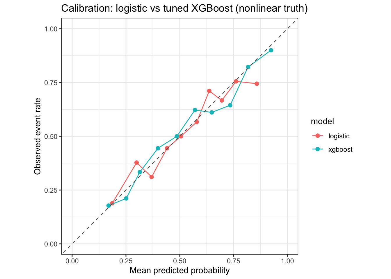
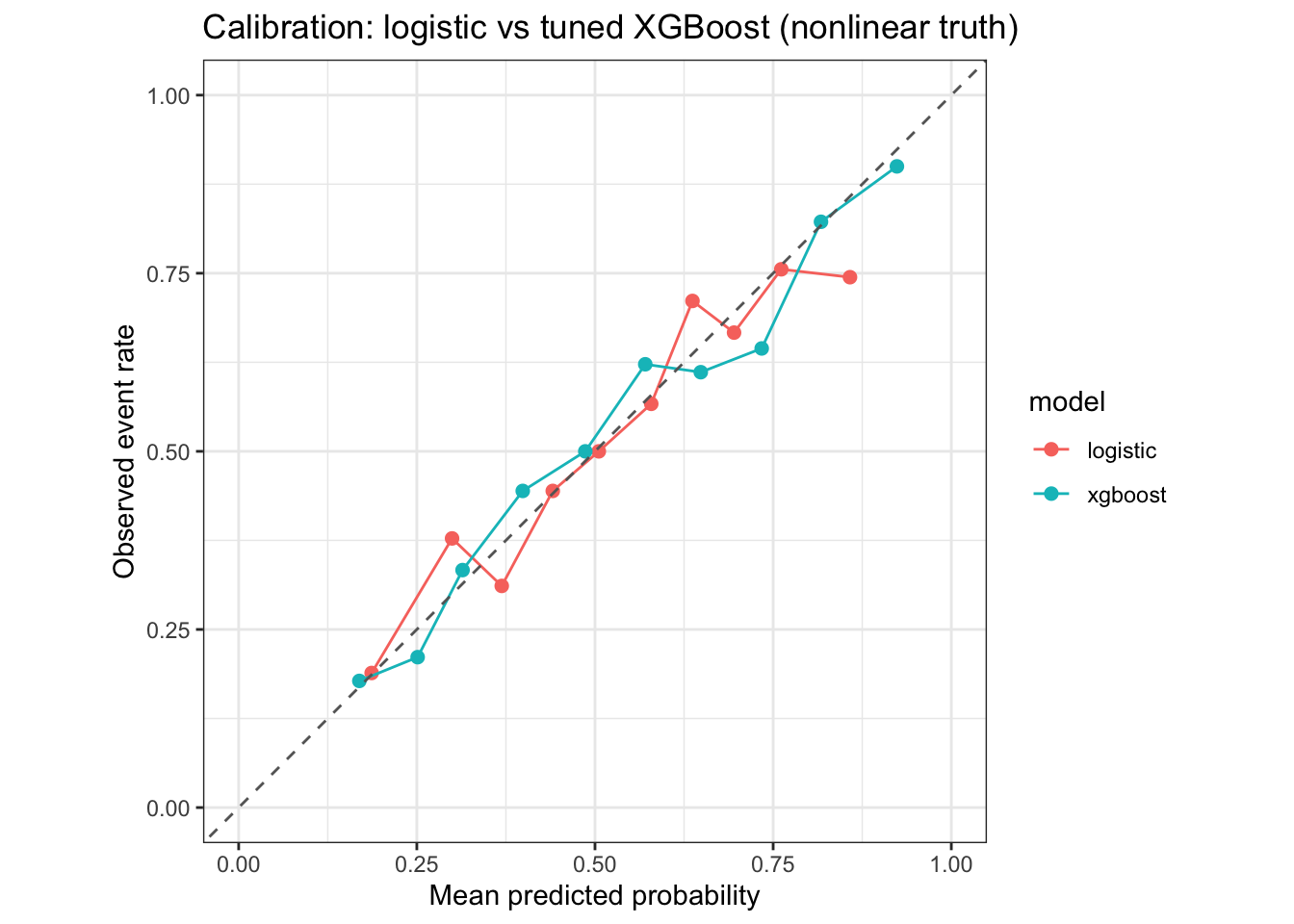
both look pretty well calibrated. Close to straight diagonal line with well balanced. Now, let’s dive in DCA.
Decision Curve Analysis
dca_df |>
  pivot_longer(-pt, names_to = "strategy", values_to = "net_benefit") |>
  ggplot(aes(pt, net_benefit, color = strategy)) +
  geom_line(linewidth = 1) +
  coord_cartesian(ylim = c(-0.05, max(dca_df$nb_treatall, na.rm=TRUE) + 0.05)) +
  labs(x = "Threshold probability", y = "Net benefit",
       title = "DCA: nonlinear truth, logistic vs tuned XGBoost") +
  theme_bw()
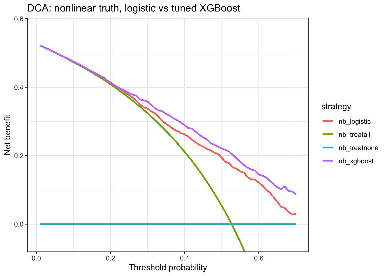
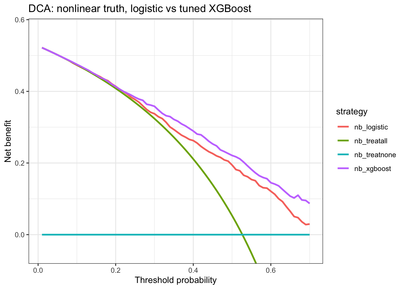
My interpretation is that XGBoost consistently has a higher net benefit compared to logistic regression from threshold ≥0.25. If I’m comfortable screening 10 people to get at least 4 positives — which means a threshold of 0.4, since it’s not too invasive and not too costly — then the net benefit of using XGBoost is about 0.28. That means I’d gain 28 true-positive-equivalents for every 100 people screened, and about 3 more true-positive-equivalents than logistic regression at that same threshold.
This article by Vickers et al is really helpful in turning the threshold verbage to preference. Making the threshold as “If I screen/intervene x amount of samples, I get y amount of true positive” and making it how concerned I am to miss something vs how concerned I am that it’s more harmful getting more screened/intervened on. Another great reference is
this.
A note for myself, while reading all these I was a bit confused on the term “treat all” and “treat none”. But essentially treat all is to set sensitivity to 100% and specificity to 0%, and treat none would be to set sensitivity 0% and specificity to 100%. And with the formula net benefit = tp /n - fp * exchange_rate / n which is also net benefit = sensitivity . prevalence - (1 - specificity) . (1-prevalence) . exchange_rate.
Opportunities For Improvement
- Apply DCA next time when we have a model that is well calibrated and has good AUC, but we want to see if it’s worth using the model to make a decision.
- Find a few models in literature and do a simulation and interpret the DCA and rationale behind certain threshold
- Find other studies that used DCA and look at their interpretation
Lessons learnt
- When building a classification model, AUC is not enough, we need to look at calibration + DCA
- learnt youden index and how it works by calculating J score
- bias is a shift in the intercept, miscalibration is a shift in the slope
- learnt brier, cox calibration, DCA
If you like this article:
- please feel free to send me a comment or visit my other blogs
- please feel free to follow me on BlueSky, twitter, GitHub or Mastodon
- if you would like collaborate please feel free to contact me a
- Posted on:
- September 2, 2026
- Length:
- 20 minute read, 4084 words
- Categories:
- r R roc auc brier calibration dca decision curve analysis
- Tags:
- r R roc auc brier calibration dca decision curve analysis