Learning And Exploring The Workflow of RNA-Seq Analysis - A Note To Myself
By Ken Koon Wong in r R rna-seq DESeq2 kallisto fastp sra-tools bioconductor gsea fgsea uniprot clusterprofiler
September 27, 2025
Learned RNA-seq workflow using C. difficile data from a published study 🧬. Processed raw reads through fastp → kallisto → DESeq2 -> GSEA pipeline. Results matched the original paper’s findings, with clear differential expression between mucus and control conditions 📊.

Motivations:
To be honest, I don’t really know what RNA-seq was until I learnt more about it and its potential! On our previous learning processes, we’ve looked at Learning Antimicrobial Resistance (AMR) genes with Bioconductor, Phylogenetic Analysis, Building DNA sequence Alignment, Assemblying DNA Sequence, Learning BLAST and MLST, Exploring Long Sequence ONT Workflow. Notice that all these are DNA related. This article, we’ll explore the world of RNA! In my simplistic view, RNA-seq enables us to explore and discover transcriptomes of certain conditions, whether it can tell us a bit more of the gene expression based on certain conditions. The potential is huge! Imagine if you can tell the difference between colonization vs a true infection in a clinical setting, I wonder if differential expression analysis of transcriptome can provide us a bit more information! Differentiating infection vs contamination (?more accurate HAI definition 🤷♂️). Let’s dive into the shallow pool of the unknown world of RNA-Seq and at least learn the basics! Let’s go!
Game Plan:
Let’s look at Clostridioides difficile and see if we can find any raw cDNA sequences on ncbi. After some searching, I found this
Clostridioides difficile-mucus interactions encompass shifts in
gene expression, metabolism, and biofilm formation that might be potentially a good one to look at and see if we can somewhat reproduce what’s found.
Disclaimer:
I am not a biostatistician, neither do I work in a lab. I’m attempting to understand the bioinformatics workflow of an RNA-seq. If you find any information displayed here is wrong, please let me know so I can learn. Please verify the information presented here as well. This is a documentation of my learning process and a note for my future self to reproduce the workflow I’ve explored
Objectives:
What is RNA-Seq?
RNA-Seq, or RNA sequencing, is a powerful technique used to analyze the transcriptome of a cell or organism. The transcriptome refers to the complete set of RNA molecules, including messenger RNA (mRNA), ribosomal RNA (rRNA), transfer RNA (tRNA), and non-coding RNAs, that are present in a cell at a specific time. RNA-Seq allows researchers to study gene expression patterns, identify differentially expressed genes, and discover novel transcripts. read more on wiki. It’s usually challenging to sequence from RNA itself due to its instability and susceptibility to degradation. Therefore, RNA is typically converted into complementary DNA (cDNA) using a process called reverse transcription before sequencing. This cDNA is then used as the input for sequencing platforms. However, for short RNA sequence, nowadays with ONT, it does provide flowcells that can directly sequence RNA without the need for conversion to cDNA.
Let’s Look At Existing Data
Let’s dive into the bioproject. To download the raw sequence, we need to go through several clicks. And also understand what some of these abbreviations means.
Sequence Read Archive (SRA):
SRR - Individual sequencing runs (raw data files).
SRX - Experiments (groups related runs).
SRS - Samples (biological specimens).
SRP - Projects/Studies (collections of related experiments).
Gene Expression Omnibus (GEO):
GSM - Individual samples with expression data.
GSE - Series/datasets (collections of related samples).
GPL - Platforms (microarray or sequencing platform descriptions).
GDS - Curated datasets (processed GSE data).
Assembly Database:
ASM - Genome assemblies.
GCA - GenBank assemblies.
GCF - RefSeq assemblies.
Core Sequence Databases:
NC_ - RefSeq chromosomes/complete genomes.
NM_ - RefSeq mRNA sequences.
NP_ - RefSeq protein sequences.
XM_/XP_ - Model/predicted RefSeq sequences.
AC_ - GenBank finished genomic sequences.
BioProject & BioSample:
PRJNA - BioProject accessions (research projects).
SAMN - BioSample accessions (biological specimens).
Alright, with that out of the way, we’re interested in SRR, which should be under SRA. We can see on the bioproject page that there is SRA experiments. Click on that and it’ll bring you to a page of SRXs. Since they are very BIG files, in terms of gigs, we can’t just download from the website, we need sra-tools
## Install follow this link instruction
## https://github.com/ncbi/sra-tools/wiki/02.-Installing-SRA-Toolkit

## download SRRs example
fasterq-dump --progress --threads 4 SRR27792604
Now, repeat the above for the other SRRs and you’ll get all the raw sequences in fastq format. With our practice, we’ll only download SRR27792597,SRR27792603,SRR27792598, andSRR27792604. Two mucus and two controls. It will take sometime, which is why i like the --progress parameter. Alright, after we’ve downloaded the sequences, let’s move on to our official workflow.
The Workflow
TL;DR Quality control (fastp) -> Create transcriptome reference (kallisto) -> Assemble Raw Sequence (kallisto) -> Analyse (PCA & DESeq2)
QC of raw read
# install fastp

# run QC
fastp -i SRR27792597_1.fastq -h SRR27792597_1.html --verbose --stdout --thread 8 > /dev/null
If you’re like me who likes to know what’s going on when running, make sure to include --verbose and I found --thread is very helpful, otherwise it took sometime. Repeat for all fastq files and inspect.
What is Considered Acceptable?
I’ll be honest, I’m not sure. 🤔 According to Claude, Read Quality Metrics such as Quality Scores (Phred scores):
Q30+: >80% is good, >90% is excellent, Q20+: Should be >95%. Total Reads: Depends on our goals: Differential expression: 10-30M reads per sample, whereas Novel transcript discovery: 50-100M+ reads. Contamination and Artifacts: Adapter Content: <5%: Good, 5-20%: Moderate (should trim), >20%: High contamination. Duplication Rate: <30%: Low (genomic DNA-like), 30-70%: Normal for RNA-seq, >70%: Potentially problematic. Sequence Composition:
GC Content: Should match expected organism: Human/Mouse: ~42%, E. coli: ~50%, Yeast: ~38%; Per-base Quality: Should stay >Q28 across read length. Red Flags to Watch For Poor quality data: <10M reads for differential expression
<80% Q20 bases, Severe 3’ quality drop (below Q20), Unusual GC content spikes, 20% adapter contamination after trimming.
Our QC report is not included, but a quick glance, it looks pretty good!
Getting Reference of Transcriptome
On the article’s supplement, we found that they used FN545816.1 as reference genome. We can download them from
here. Click download and include gff as well.
# Install gffread if you don't have it
brew install gffread  # on macOS

# install kallisto
# go here https://pachterlab.github.io/kallisto/download.html for info

# extract transcriptome sequences
gffread -w transcriptome.fa -g GCA_000027105.1_ASM2710v1_genomic.fna genomic.gff
kallisto index -i transcriptome.idx transcriptome.fa
You should have transcriptome.idx and transcriptome.fa in your current working directory. What this does is that it extracts the transcriptome sequences from the genome based on the gff file, in our case it’s a specific
Clostridioides difficile R20291 assembly with accession FN545816.1. The gff file contains information about the locations of genes and other features on the genome. The -w flag specifies the output file for the transcriptome sequences, and the -g flag specifies the input genome sequence file. The resulting transcriptome.fa file contains the nucleotide sequences of all transcripts annotated in the gff file.
Now that we have the reference. Let’s assemble our raw sequence to something readable.
Assemble
# assemble, make sure to include all the other samples
kallisto quant -i transcriptome.idx \
 -o kallisto_SRR27792604 \
 --threads 8 \
 SRR27792604_1.fastq SRR27792604_2.fastq
We’d have to go through all the raw sequences we downloaded and assemble them. We’ll then see folders such as kallisto_SRR27792604. And inside the folder, we see abundance.h5 and abundance.tsv. The reason i prefer kallisto over STAR is mainly because of the speed. When I first tried STAR it was very slow and no progress bar. The output of these files are actually quite small. Let’s take a look!
library(tximport)
library(DESeq2)

# Create file paths for all samples
files <- c("kallisto_SRR27792597/abundance.h5",
           "kallisto_SRR27792603/abundance.h5",
           "kallisto_SRR27792598/abundance.h5",
           "kallisto_SRR27792604/abundance.h5")

# Name them
names(files) <- c("mucus_rep1", "control_rep1", "mucus_rep2", "control_rep2")

# Import data
txi <- tximport(files, type = "kallisto", txOut = TRUE)

coldata <- data.frame(
  condition = c("mucus", "control", "mucus", "control"),  # or however they're grouped
  row.names = names(files)
)

dds <- DESeqDataSetFromTximport(txi, colData = coldata, design = ~ condition)
Just as a note, there are another way we can create from matrix and count as well using tsv.
PCA
# Perform variance stabilizing transformation
vsd <- vst(dds, blind = FALSE)

# Plot PCA
plotPCA(vsd, intgroup = "condition")
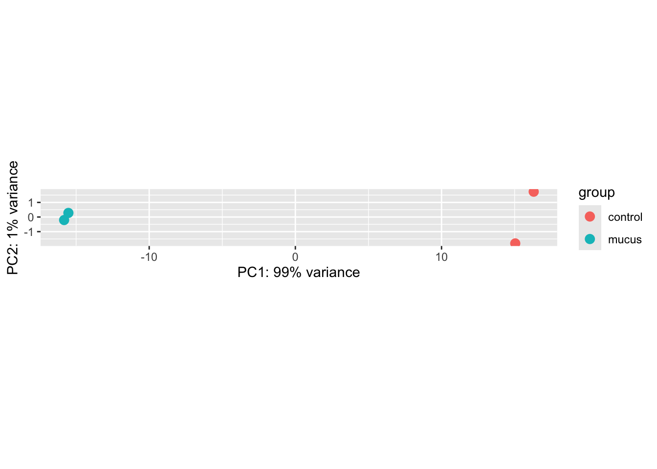
Wow, it looks like the treatment and control are separated quite well! Let’s dive straight into differential expression analysis. If we look at figure 2B on the article, it looks very similar, even though we haven’t include the full sequences.
DESeq2
library(tidyverse)

# Run DESeq2 analysis
dds <- DESeq(dds)

# Get results
res <- results(dds, tidy = T)

# View summary
summary(res)
##      row               baseMean       log2FoldChange         lfcSE
##  Length:3570        Min.   :      0   Min.   :-8.42507   Min.   :0.06850
##  Class :character   1st Qu.:    326   1st Qu.:-0.51037   1st Qu.:0.08493
##  Mode  :character   Median :   1313   Median : 0.00074   Median :0.10664
##                     Mean   :  12154   Mean   :-0.01934   Mean   :0.16100
##                     3rd Qu.:   4999   3rd Qu.: 0.53025   3rd Qu.:0.16896
##                     Max.   :3272163   Max.   : 3.75721   Max.   :4.98958
##                                       NA's   :1          NA's   :1
##       stat               pvalue               padj
##  Min.   :-80.75478   Min.   :0.0000000   Min.   :0.0000000
##  1st Qu.: -4.39763   1st Qu.:0.0000000   1st Qu.:0.0000000
##  Median :  0.00566   Median :0.0001034   Median :0.0002068
##  Mean   : -0.71728   Mean   :0.1229994   Mean   :0.1366817
##  3rd Qu.:  3.44035   3rd Qu.:0.0970157   3rd Qu.:0.1293422
##  Max.   : 28.59200   Max.   :0.9978324   Max.   :0.9978324
##  NA's   :1           NA's   :1           NA's   :1
# positive
res |>
  filter(log2FoldChange > 0) |>
  arrange(padj, desc(log2FoldChange)) |>
  head(10)
##                   row  baseMean log2FoldChange      lfcSE     stat
## 1  gene-CDR20291_1626  2872.357       2.999390 0.10490313 28.59200
## 2  gene-CDR20291_2014 32895.724       2.043527 0.07250627 28.18414
## 3  gene-CDR20291_0509 54339.793       1.925179 0.07046733 27.32016
## 4  gene-CDR20291_2174 13209.067       1.957986 0.07539631 25.96926
## 5  gene-CDR20291_2495 24664.096       2.321013 0.08978192 25.85168
## 6  gene-CDR20291_0508  8811.393       2.021692 0.07967500 25.37423
## 7  gene-CDR20291_2738  9037.752       1.859512 0.07781080 23.89787
## 8  gene-CDR20291_1446  4410.271       1.982683 0.08581234 23.10487
## 9  gene-CDR20291_2871  3862.148       1.912250 0.08437678 22.66322
## 10 gene-CDR20291_2017  5272.620       1.784124 0.08208607 21.73479
##           pvalue          padj
## 1  8.448830e-180 1.076924e-177
## 2  9.148740e-175 1.053286e-172
## 3  2.444054e-164 2.643282e-162
## 4  1.102039e-148 9.832939e-147
## 5  2.329704e-147 2.027979e-145
## 6  4.856404e-142 3.939206e-140
## 7  3.223217e-126 2.170502e-124
## 8  4.136645e-118 2.636372e-116
## 9  1.033340e-113 6.250829e-112
## 10 9.621927e-105 5.283178e-103
# negative
res |>
  filter(log2FoldChange < 0) |>
  arrange(padj, log2FoldChange) |>
  head(10)
##                   row   baseMean log2FoldChange      lfcSE      stat pvalue
## 1  gene-CDR20291_3145 195320.938      -8.425071 0.10432907 -80.75478      0
## 2  gene-CDR20291_2142  14441.266      -5.528640 0.08551642 -64.65004      0
## 3  gene-CDR20291_1557  21279.449      -4.484919 0.11271527 -39.78981      0
## 4  gene-CDR20291_0332  11550.169      -4.080126 0.08702073 -46.88683      0
## 5  gene-CDR20291_0331   4196.984      -3.907433 0.09507966 -41.09641      0
## 6  gene-CDR20291_2206   6931.606      -3.821015 0.08700146 -43.91897      0
## 7  gene-CDR20291_1078  28192.247      -3.531056 0.08204064 -43.04033      0
## 8  gene-CDR20291_2237   6355.265      -3.491135 0.08384686 -41.63704      0
## 9  gene-CDR20291_0330   6786.174      -3.481683 0.08283612 -42.03097      0
## 10 gene-CDR20291_2238   6034.666      -3.430734 0.08338778 -41.14193      0
##    padj
## 1     0
## 2     0
## 3     0
## 4     0
## 5     0
## 6     0
## 7     0
## 8     0
## 9     0
## 10    0
Interesting thing about the pvalue, we need to look at adjust pval instead because we are doing multiple comparison. Adjust pvalue is via Benjamini-Hochberg method. This adjust the multiplicity of comparison.
QC plots
Thanks to John Blischak feedback on incorporating these QC plots. We’re going to assess our first plot
MA plot
plotMA(dds)
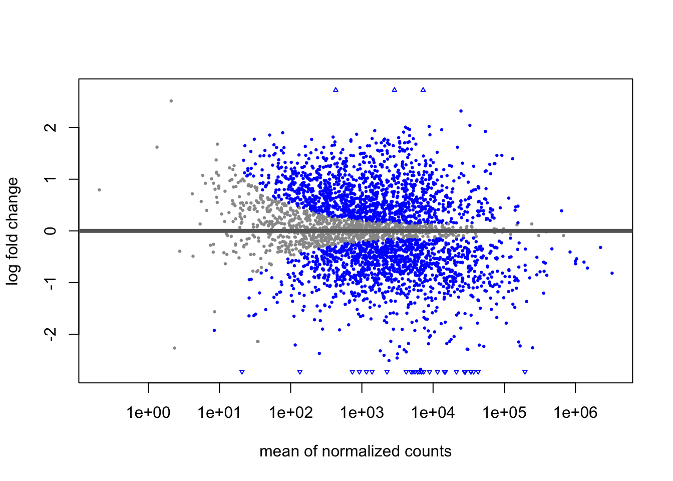
An MA plot shows fold change (y-axis) versus average expression (x-axis) for each gene, with blue indicating significance. A good plot should be symmetric around y=0 with a trumpet shape (more variance at low expression), and our plot looks healthy with no signs of bias or technical problems.
Now, if you’re like me, I had a hard time trying to understand how this plot was created. Let’s ggplot this.
code
library(tidyverse)

res |>
  drop_na() |>
  mutate(sig = case_when(
    padj < 0.05 ~ 1,
    TRUE ~ 0
  ) |> as.factor()) |>
  ggplot(aes(x=log10(baseMean),y=log2FoldChange, color=sig)) +
  geom_point(alpha=0.5, size=0.5) +
  ylim(c(-3,3)) +
  geom_hline(yintercept = 0) +
  scale_color_manual(values=c("grey","blue")) +
  theme_minimal() +
  theme(legend.position = "none")
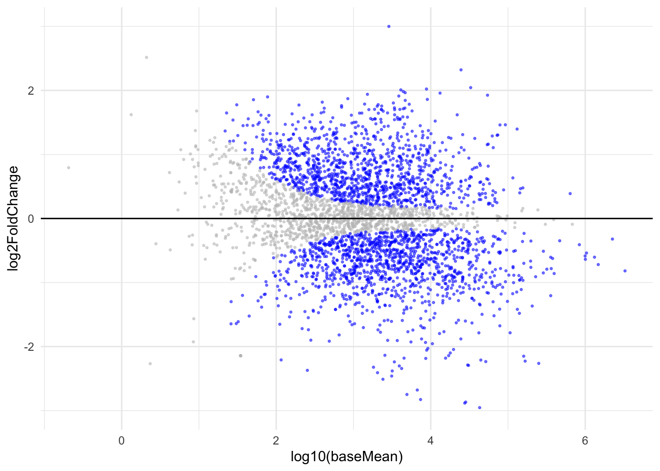 Wow, when you try to recreate it is when you truly understand what these plots represent. Learnt that the mean of normalized count is actually in log10!
Dispersion Plot
plotDispEsts(dds)
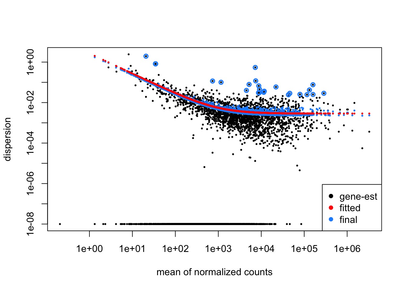
The dispersion plot shows how DESeq2 estimates gene variability (y-axis) across expression levels (x-axis), where black dots are initial per-gene estimates, the red curve is the fitted trend, and blue dots are final shrunken estimates used for testing. You want to see black dots scattered around the red trend with blue dots pulled toward it, indicating successful information sharing across genes - if most genes are far from the trend or the curve doesn’t fit well, it suggests problems with your experimental design or data quality.
code
mcols(dds) |>
  as_tibble() |>
  ggplot(aes(x = log10(baseMean))) +
  geom_point(aes(y = dispGeneEst), size = 0.5, alpha = 0.5) +  # Black: gene estimates
  geom_point(aes(y = dispFit), color = "red", size = 0.8) +    # Red: fitted trend
  geom_point(aes(y = dispersion), color = "blue", size = 1) +  # Blue: final values
  scale_y_log10() +
  labs(x = "mean of normalized counts",
       y = "dispersion") +
  theme_minimal()
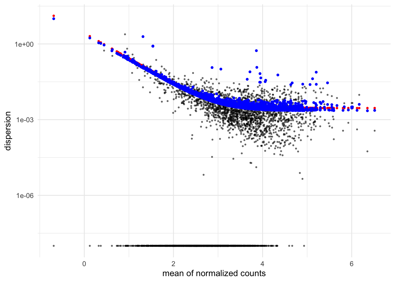 Notice how the dispersion is also log transformed with `scale_y_log10`?
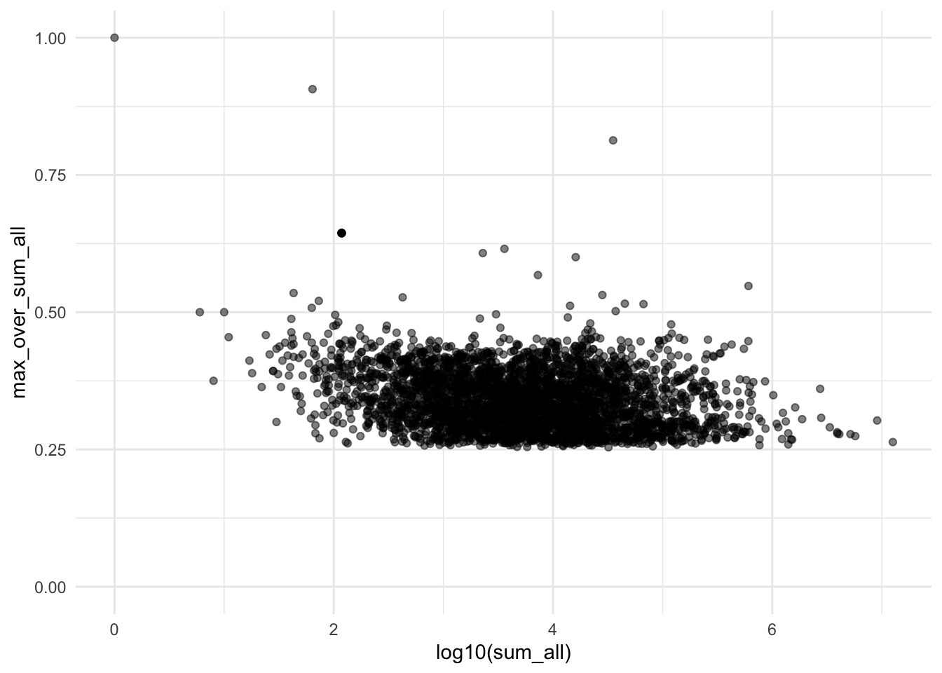
Sparsity Plot
plotSparsity(dds)
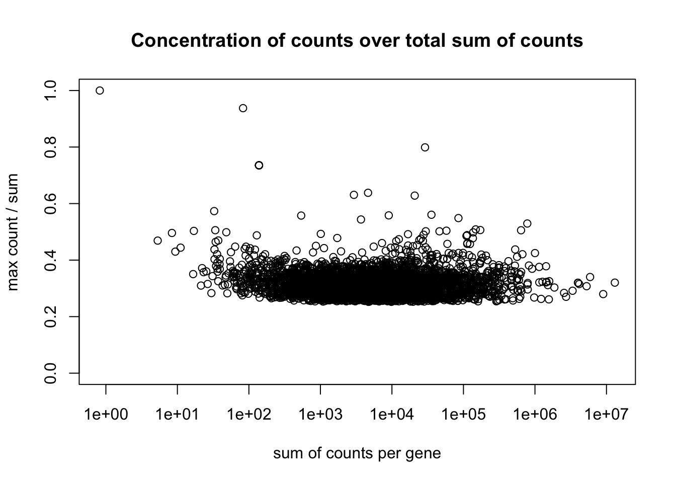
The sparsity plot shows whether gene counts are evenly distributed across samples (y-axis) versus concentrated in just one or two samples, plotted against total expression level (x-axis). You want most genes clustered around 0.25-0.4 on the y-axis (indicating even distribution)
code
count <- counts(dds, normalized=F)

as_tibble(count) |>
  rowwise() |>
  mutate(sum_all = sum(across(everything())),
         max = max(mucus_rep1,control_rep1,mucus_rep2,control_rep2)) |>
  mutate(max_over_sum_all = max / sum_all) |>
  ggplot(aes(x=log10(sum_all),y=max_over_sum_all)) +
  geom_point(alpha=0.5) +
  theme_minimal() +
  ylim(0,1)
Volcano plot
library(ggplot2)
library(ggrepel)

# Define specific genes to label
genes_to_label <- c("gene-CDR20291_1626", "gene-CDR20291_0508", "gene-CDR20291_1446",
                    "gene-CDR20291_2495", "gene-CDR20291_0455", "gene-CDR20291_0876",
                    "gene-CDR20291_0877", "gene-CDR20291_1275", "gene-CDR20291_0875",
                    "gene-CDR20291_3145")

# Create labeled volcano plot
res |>
  filter(!is.na(padj)) |>
  mutate(label = ifelse(row %in% genes_to_label, str_extract(row, "\\d+$"), "")) |>
  mutate(color = case_when(
    log2FoldChange < -1 & padj <= 0.01 ~ "negative",
    log2FoldChange > 1 & padj <= 0.01 ~ "positive",
    TRUE ~ "neutral"
  )) |>
  ggplot(aes(x = log2FoldChange, y = -log10(padj), color = color)) +
  geom_point(alpha = 0.2) +
  geom_vline(xintercept = c(-1, 1), linetype = "dashed") +
  geom_hline(yintercept = -log10(0.01), linetype = "dashed") +
  geom_text_repel(aes(label = label),
                  size = 5,
                  # box.padding = 0.3,
                  max.overlaps = 20) +
  labs(title = "Volcano Plot - Mucus vs Control",
       x = "Log2 Fold Change",
       y = "-Log10 Adjusted P-value") +
  scale_color_manual(values = c("positive" = "red", "negative" = "blue", "neutral" = "grey")) +
  theme_bw() +
  theme(legend.position = "none")
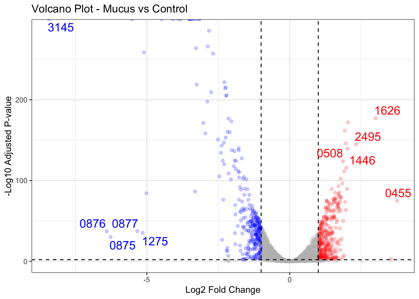
If we look at figure 2A, it again looks very similar! To interpret the volcano plot, we basically look at the the top right and top left of the plot. These are the ones that are significantly differentially expressed. The top right are the upregulated genes, whereas the top left are the downregulated genes. We can see that gene-CDR20291_1626 is the most upregulated gene, whereas gene-CDR20291_3145 is the most downregulated gene. 🙌
Looking at NCBI, looks like 1626 is a
putative sodium/phosphate cotransporter [Clostridioides difficile R20291]. And 3145 is
probable protease. What this means is that Cdiff when exposed to mucus when compared to control, the putative sodium/phosphate cotransporter expressed gene was found more (in mucus group), whereas the probable protease expressed gene was found less (in mucus group).
Now, how can we then look at these information in a higher functiona level? In comes Gene set Enrichment Analysis!
Gene Set Enrichment Analysis
Step 1: Download Cdiff Genetic Ontology
Click on
this and click on ALL and download tsv. Make sure to include genetic ontology. I found (UniProt)[https://www.uniprot.org/] to be very user friendly in getting the Genetic Ontology description.
Step 2: Create tables
library(tidyverse)

cdiff <- read_tsv("uniprotkb_CDR20291_2025_09_28.tsv")

(go_activity <- cdiff |>
  dplyr::select(`Gene Ontology (GO)`) |>
  separate_longer_delim(`Gene Ontology (GO)`, delim = ";") |>
  mutate(GO_raw = str_trim(`Gene Ontology (GO)`)) |>
  distinct() |>
  mutate(activity = str_extract(GO_raw, ".*(?= \\[GO)")) |>
  mutate(GO = str_extract(GO_raw, "(?<= \\[).*(?=\\])")) |>
  dplyr::select(GO, activity) |>
  drop_na())

(go_gene <- cdiff |>
  mutate(gene = str_extract(`Gene Names`,"CDR.*")) |>
  mutate(go = map(.x=`Gene Ontology (GO)`, .f=~str_extract_all(.x, "(?<=\\[).*?(?=\\])") |> _[[1]])) |>
  dplyr::select(gene, go) |>
  unnest(go) |>
  select(go, gene) |>
  drop_na())

res_tibble <- tibble(res) |>
  mutate(row = str_extract(row, "(?<=gene-).*")) |>
  drop_na()


Step 3: GSEA
### GSEA
library(clusterProfiler)

gene_ranks <- setNames(sign(res_tibble$log2FoldChange) *
                         (-log10(pmax(res_tibble$padj, 1e-300))),
                       res_tibble$row)

# Sort in decreasing order
gene_ranks <- sort(gene_ranks, decreasing = TRUE)

# Run GSEA using your custom C. diff GO database
gsea_results <- GSEA(geneList = gene_ranks,
                     TERM2GENE = go_gene,
                     TERM2NAME = go_activity,
                     pvalueCutoff = 0.25,
                     pAdjustMethod = "BH")
Also, notice that we have to use pmax when calculating the rank because when p value is too small, the log of it will ne inf. Notice we decreased the pvaluecutoff to discover more functional categories.
Step 4: Visualize
library(ggplot2)

tibble(
  pathway = gsea_results@result$Description,
  NES = gsea_results@result$NES
) |>
  mutate(fill = case_when(
    NES > 0 ~ "positive",
    NES < 0 ~ "negative"
  )) |>
ggplot(aes(x = NES, y = reorder(pathway, NES), fill = fill)) +
  geom_col(color = "black") +
  labs(x = "Normalized Enrichment Score", y = "Functional Categories") +
  theme_minimal() +
  theme(legend.position = "none")
 Wow, now this is useful I think. The most significant ones were
 structural constituent of ribosome and rRNA binding functions were downregulated in mucus group when compared to control when we use pval of 0.05. However, as the above plot showed, if pval set as 0.25, then we see all these other categories. Very interesting to see resnponse to antibiotics function were downregulated in mucus group!
Now, mind you, the above is not the same database as the article. The article uses KEGG, a different pathway than us.
Acknowledgement
Thanks again to John Blischak feedback, we learnt a missing step that is important, that is to assess our DESeq2 object with QC plots.
Opportunities for improvement
- I should probably rewrite the above to a script and with function so that in the future we can easily reproduce any DE analysis
- include
esearchorentrezto get accession metadata for more accurate label - include
heatmap
Lessons Learnt
- learnt the basics of
sra-tools fasterq-dump,fastp,kallisto,DESeq2. - took me a while to find the right
referenceisolate. Found in on their supplement material and got the right one. For future reference, don’t assume they use the popular refseq, look through their procedure and get that specifically. - learnt from raw RNA-seq QC
- learnt to interpret volcano plot
- learnt GSEA
If you like this article:
- please feel free to send me a comment or visit my other blogs
- please feel free to follow me on BlueSky, twitter, GitHub or Mastodon
- if you would like collaborate please feel free to contact me