Exploring Non-linear Effects: Visual CATE Analysis of Continuous Confounders, Binary Exposures, and Continuous Outcomes
By Ken Koon Wong in r R cate gam dataviz richard mcelreath calculus derivative dag golem owl
January 28, 2024
It was enjoyable to visualize the non-linear relationship with interaction and observe the corresponding changes in CATE. If one understands the underlying equation, it’s possible to easily obtain the ATE using calculus. Lastly, adopting Richard McElreath’s Owl framework as a documented procedure ensures quality assurance! 🙌

Question of the Day
Is there a change in CATE if there is interaction between our confounder and exposure, present of non-linear relationship of confounder and outcome? It sounds like there should be, shouldn’t it? Let’s test the theory out
One of my goals this year is to finish Statistical Rethinking videos by Richard McElreath. Using his scientific framework of establishing DAG, Golem, and Owl to go through this interesting question we have, without bayesian method.
If you’re only interested in the non-linear effect exploration, please skip to
Visualization or follow the <- TL;DR on objectives.
Objectives:
- Truth <- TL;DR
- DAG
- Golem
- Owl
- Visualization <- TL;DR
- Lessons learnt
Truth ✅
library(tidyverse)
library(mgcv)
library(ggpubr)

set.seed(1)
n <- 10000
x <- rnorm(n)
t <- rbinom(n, 1, plogis(0.5*x))
z <- rnorm(n)
y <- x^2 + 2*x*t + 5*t + 0.5*z + rnorm(n)
df <- tibble(x=x,y=y,t=t,z=z)
Let’s take a look at the above. To test our theory out, we should construct a world where we know the truth. The above relationship of y, x, z and t. Here we will treat y as a continuous outcome, x as our continuous confounder, t as our binary exposure, and z (which has not relationship to x or z). And we’re interesting in finding out the conditional average treatment effect (CATE), given the change of x.
The truth here lies in the equation y <- x^2 + 2*x*t + 5*t + 0.5*z + rnorm(n). We’ve constructed the outcome whereby we know the functional relationship of y with respect to x, t, and z. We also know that x influences t as well.
DAG
Transparent scientific assumptions to justify scientific effort, expose it to useful critique, and connect theories to golems
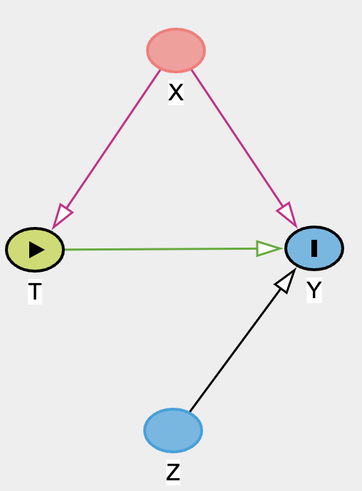
Let’s assume that we know the structural relationships of all the nodes as depicted above. The interesting thing about DAG is you don’t actually need to know the functional relationships to create one. DAG is helpful in communicating the causal model to further guide the creation of golem, aka statistical model / estimators.
Golem
Brainless, powerful statistical models

Now, in order for us to know what statistical models to use, we’d have to know the underlying functional relationships of each nodes. Are the relationships linear or non-linear? Are there confounders that need adjustment or colliders that need mindful adjustment avoidance?
Since we don’t really know the true functional relationships between the nodes, we will consider both linear (linear regression) and non-linear approaches (generalized additive model). Also given the DAG above, we need to adjust for x to assess for ATE which is E(y|t=1,X=x) - E(y|t=0,X=x), and nothing else.
Owl
Documented procedures, quality assurance

The point of the Owl is to bring everything together in a procedural format project after project. To produce a documentation of transparency and also the thought process of the causal model to the analysis. The previous DAG and golem fit right in here as well on 1 and 2. Below are the steps.
Steps to draw the Owl:
- Theoretical estimand -> DAG
- Scientific (causal) model(s) -> Golem
- Use (1) & (2) to build statistical model(s)
- Simulate from (2) to validate (3) yields (1)
- Analyze real data
Since we have gone through 1 and 2, let’s put some work into 3 and 4 before we dive into 5 which is contained in df as simulated earlier on when we constructed the truth.
Golem 1: Assuming Linear Relationships
set.seed(1)
n <- 10000
x <- rnorm(n) #confounder
t <- rbinom(n, 1, plogis(0.2*x)) #exposure binary
z <- rnorm(n)
y <-  0.1*x + 3*t + 0.4*z + rnorm(n) #outcome

df_sim <- tibble(x=x,y=y,t=t,z=z)

sim_model <- lm(y ~ x + t, df_sim)
summary(sim_model)
##
## Call:
## lm(formula = y ~ x + t, data = df_sim)
##
## Residuals:
##     Min      1Q  Median      3Q     Max
## -3.6850 -0.7383  0.0025  0.7330  3.7861
##
## Coefficients:
##             Estimate Std. Error t value Pr(>|t|)
## (Intercept) 0.002103   0.015329   0.137    0.891
## x           0.101445   0.010754   9.433   <2e-16 ***
## t           3.015260   0.021774 138.483   <2e-16 ***
## ---
## Signif. codes:  0 '***' 0.001 '**' 0.01 '*' 0.05 '.' 0.1 ' ' 1
##
## Residual standard error: 1.082 on 9997 degrees of freedom
## Multiple R-squared:  0.6644,	Adjusted R-squared:  0.6643
## F-statistic:  9895 on 2 and 9997 DF,  p-value: < 2.2e-16
Golem 2: Assuming Non-linear Relationships
set.seed(1)
n <- 10000
x <- rnorm(n) #confounder
t <- rbinom(n, 1, plogis(0.2*x)) #exposure binary
z <- rnorm(n)
y <- x^2 + 3*t + 0.4*z + rnorm(n) #outcome

df_sim <- tibble(x=x,y=y,t=t,z=z)

df_sim |>
  ggplot(aes(x=x,y=y,color=as.factor(t))) +
  geom_point()
Alright, do you think linear regression and GAM would produce a different CATE with this simulated dataset?
model_lr <- lm(y ~ x + t, df_sim)
model_gam <- gam(y ~ s(x, k = 10) + x + t, data = df_sim)

cate_x_lr <-  predict(model_lr,newdata=tibble(x=x,t=1)) - predict(model_lr,newdata=tibble(x=x,t=0))
cate_x_gam <- predict(model_gam,newdata=tibble(x=x,t=1)) - predict(model_gam,newdata=tibble(x=x,t=0))

tibble(x=x, cate_x_lr=cate_x_lr,cate_x_gam=cate_x_gam) |>
  pivot_longer(cols = starts_with("cate"), names_to = "model", values_to = "cate") |>
  ggplot(aes(x=x,y=cate,color=model)) +
  geom_point()
print(paste0("ate_lr: ",cate_x_lr |> mean()))
## [1] "ate_lr: 2.98384150376772"
print(paste0("ate_gam: ",cate_x_gam |> mean()))
## [1] "ate_gam: 3.01499684018495"
Very very small difference when there is no interaction. What if there is interaction? Let’s simulate
Golem 3: Assuming Non-linear Relationships with Interactions
set.seed(1)
n <- 10000
x <- rnorm(n) #confounder
t <- rbinom(n, 1, plogis(0.2*x)) #exposure binary
z <- rnorm(n)
y <- x^2 + 4*x*t + 3*t + 0.4*z + rnorm(n) #outcome

df_sim <- tibble(x=x,y=y,t=t,z=z)

df_sim |>
  ggplot(aes(x=x,y=y,color=as.factor(t))) +
  geom_point()
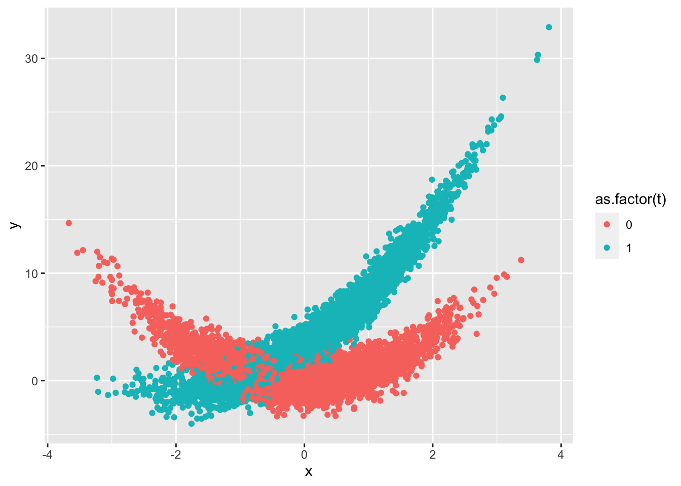
Wow, OK that looks a bit more complicated. Let’s take a look at the CATE
model_lr <- lm(y ~ x*t, df_sim)
model_gam <- gam(y ~ s(x, k = 10) + x + t + x:t, data = df_sim)

cate_x_lr <-  predict(model_lr,newdata=tibble(x=x,t=1)) - predict(model_lr,newdata=tibble(x=x,t=0))
cate_x_gam <- predict(model_gam,newdata=tibble(x=x,t=1)) - predict(model_gam,newdata=tibble(x=x,t=0))

tibble(x=x, cate_x_lr=cate_x_lr,cate_x_gam=cate_x_gam) |>
  pivot_longer(cols = starts_with("cate"), names_to = "model", values_to = "cate") |>
  ggplot(aes(x=x,y=cate,color=model)) +
  geom_point()
print(paste0("ate_lr: ",cate_x_lr |> mean()))
## [1] "ate_lr: 2.95641106287701"
print(paste0("ate_gam: ",cate_x_gam |> mean()))
## [1] "ate_gam: 2.98877579715275"
Alright! As you can see there is a difference with CATE but not so much with ATE.
Now that we have entertained the idea of linear, non-linear, non-linear with interaction relationships, let’s go ahead and take a look at df which is going to be our real data. Note that in real life, we won’t know that actual formula y <- x^2 + 2*x*t + 5*t + 0.5*z + rnorm(n), we will only know the measurements (df) but don’t know the relationships between the nodes until we use DAG, golem and owl to estimate the function.
Owl Step 5: Analyze real data
Remember our real data resides in df. Let’s take a look at the inter-nodal relationships by exploratory data analysis.
library(GGally)

df |>
  mutate(t = as.factor(t)) |>
  ggpairs()
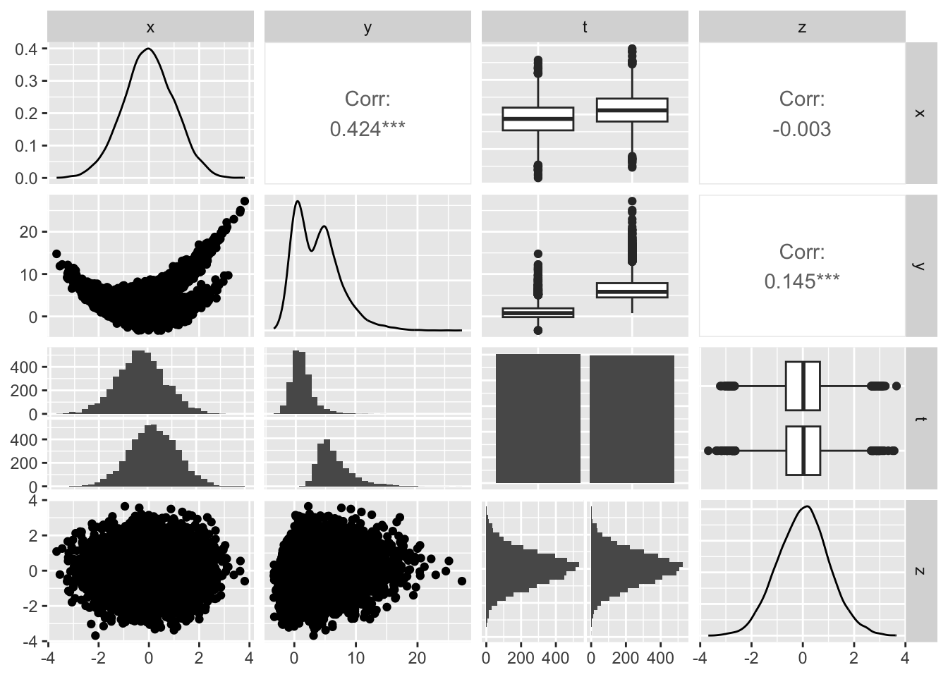
Fuctional Relationships:
It appears that:
yandx: non-linear, ?is there interactionyandt: linearyandz: non-linear, not really sure what this looks like 🤣xandt: ?linear vs no relationship, hard to see the differencexandz: ?no relationshiptandz: no relationship, looks random
Let’s inspect x and t
t.test(x ~ t, df)
##
## 	Welch Two Sample t-test
##
## data:  x by t
## t = -25.616, df = 9996.9, p-value < 2.2e-16
## alternative hypothesis: true difference in means between group 0 and group 1 is not equal to 0
## 95 percent confidence interval:
##  -0.5408035 -0.4639183
## sample estimates:
## mean in group 0 mean in group 1
##      -0.2557583       0.2466026
OK, there is a relationship there, given the distributions, we’ll consider them linear.
Let’s inspect for interaction y, x, and t
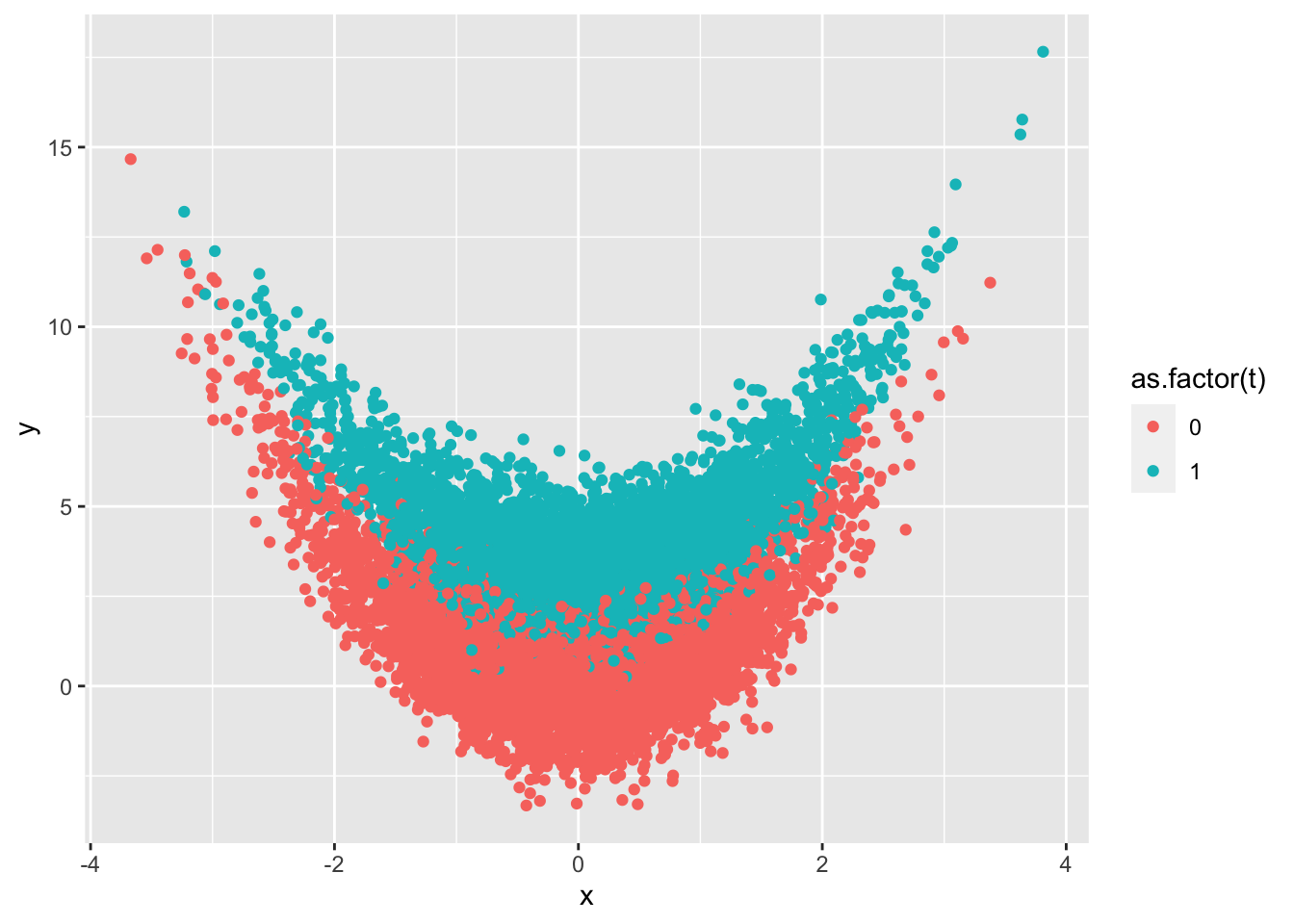
df |>
  ggplot(aes(x=x,y=y,color=as.factor(t))) +
  geom_point()
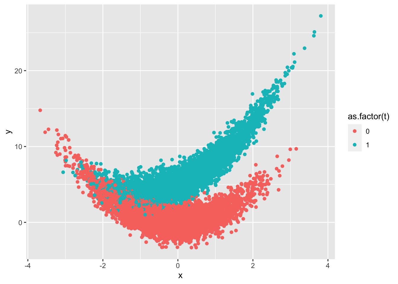
Alright, some interaction there towards the tail ends below 0. We shall use Golem 3 and compare linear regression and gam models.
Visualization
# linear regression w interaction
model <- lm(y ~ x*t, df)

plot_linear <- df |>
  add_column(pred=predict(model, newdata=tibble(x=x,t=t))) |>
  ggplot(aes(x=x,y=y,color=as.factor(t))) +
  geom_point() +
  geom_point(aes(x=x,y=pred), color = "red") +
  ggtitle("Linear Regression With Interaction") +
  theme(legend.position = "none")

# calculate cate for lr
cate <- predict(model,newdata=tibble(x=x,z=z,t=1)) - predict(model,newdata=tibble(x=x,z=z,t=0))

# gam w interaction
model2 <- gam(y ~ s(x, k = 10) + x + t + x:t, data = df)

plot_nonlinear <- df |>
  add_column(pred=predict(model2, newdata=tibble(x=x,t=t))) |>
  ggplot(aes(x=x,y=y,color=as.factor(t))) +
  geom_point() +
  geom_point(aes(x=x,y=pred), color = "red") +
  ggtitle("GAM With Interaction") +
  theme(legend.position = "none")

# calculate cate for gam
cate2 <- predict(model2,newdata=tibble(x=x,t=1)) - predict(model2,newdata=tibble(x=x,t=0))

# visualize all model cates to assess differences
cate_all <- tibble(x=x, cate=cate,cate2=cate2) |>
  mutate(cate3 = 2*x+5) |>
  pivot_longer(cols = starts_with("cate"), names_to = "model", values_to = "cate") |>
  ggplot(aes(x=x,y=cate,color=model)) +
  geom_point() +
  ggtitle("Visualizing all models' CATE")

ggarrange(plot_linear, plot_nonlinear)
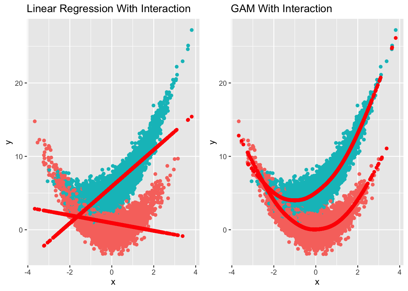
t==1 is depicted as turqoise color, whereas t==0 is red in color.
Wow, this comparison really helped me to visualize why we need to find the right estimator depending on the functional relationship of outcome, exposure and confounder(s). On the left, we have built a linear regression model, as you can see it basically fit one straight line on t==1 and another on t==0. The difference of that, given value x, would be CATE.
Same goes with the graph on the right. Now this time, we fit GAM model with splines to fit those points for t==1 and t==0. I reckon the CATE would be different from linear model. Let’s visualize it!
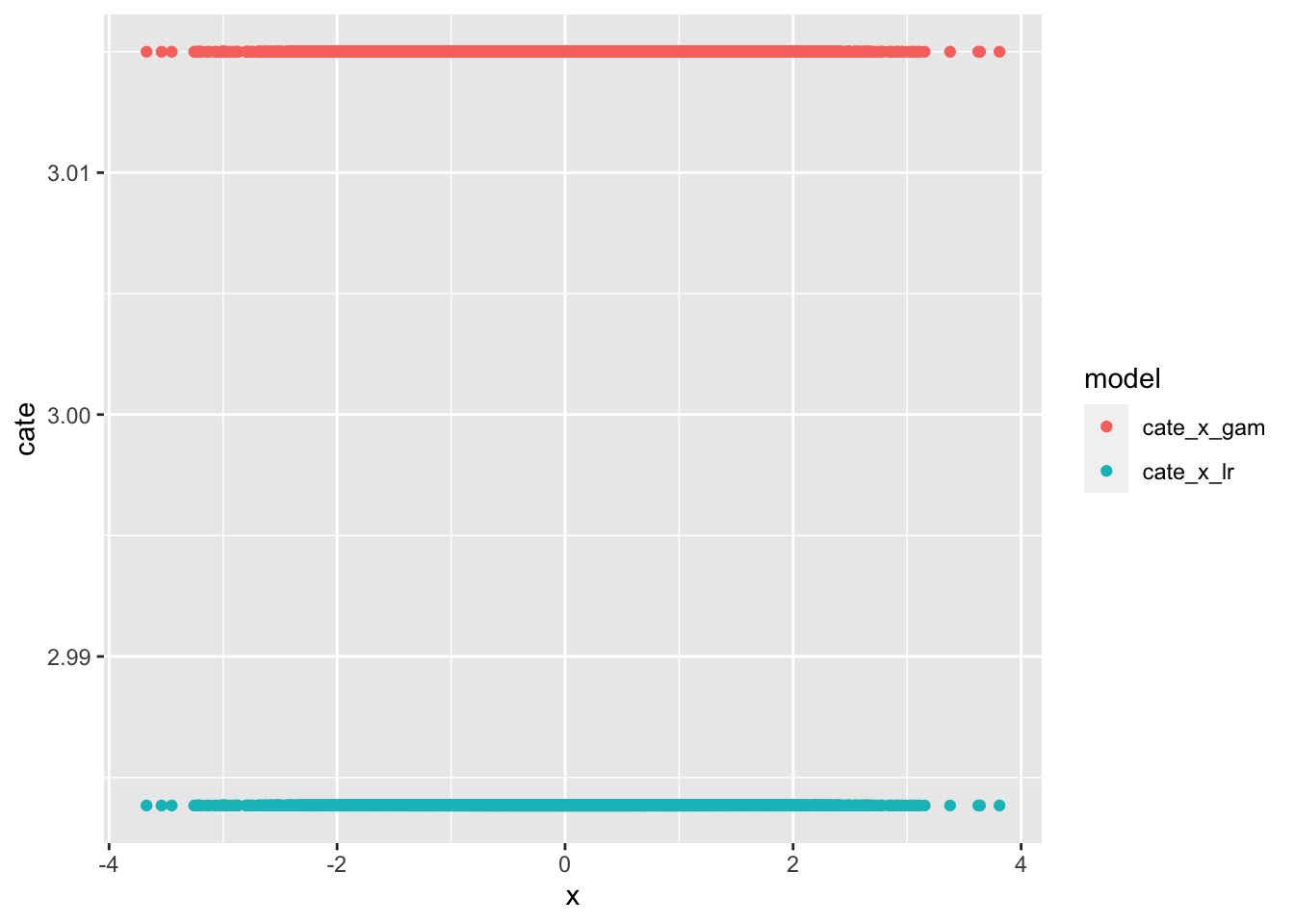
Visualizing CATE of All Models
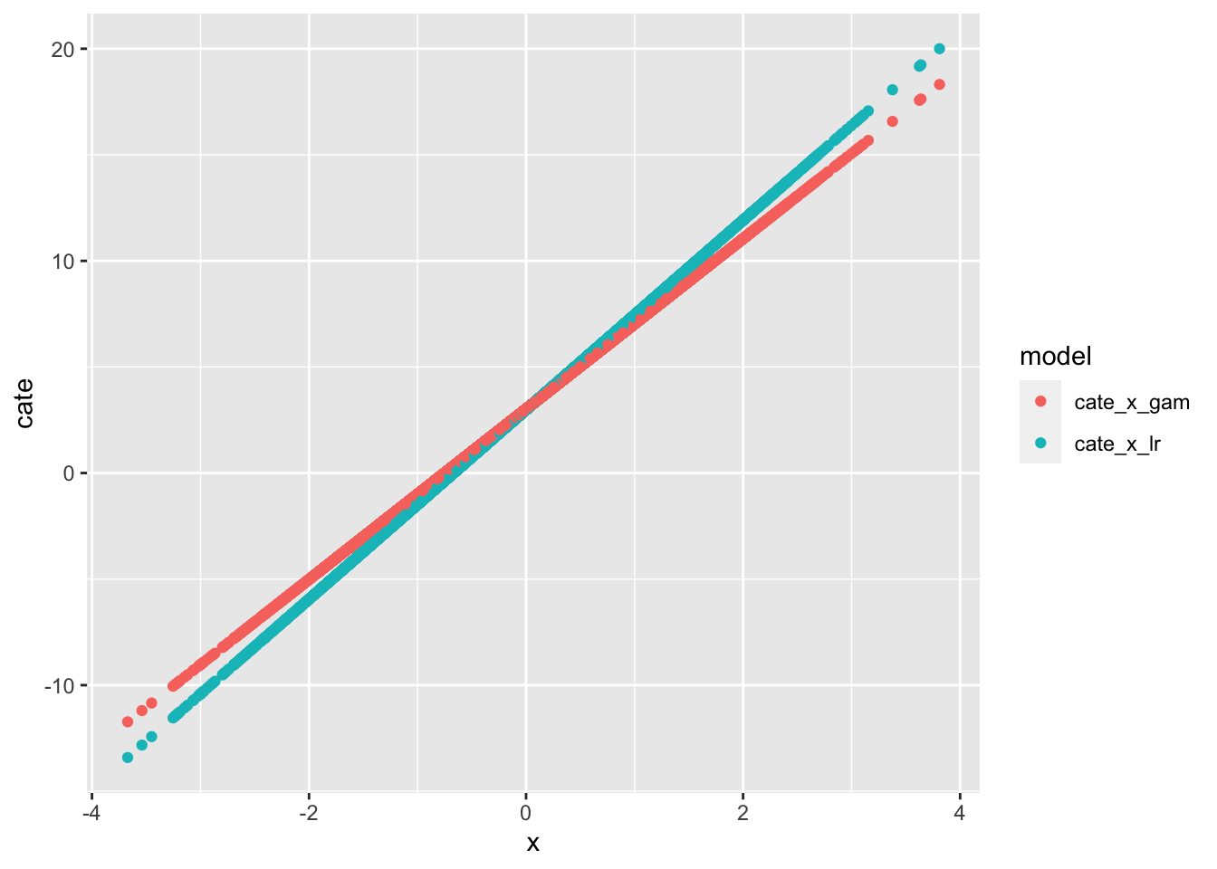
cate_all
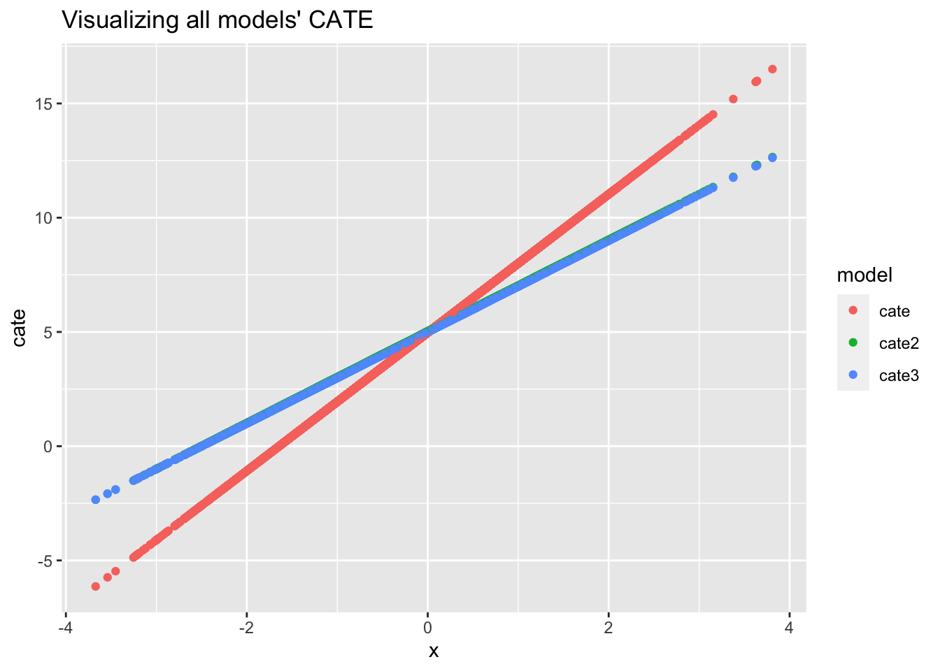
Wow, the only time when CATE is the same between linear regression and GAM model is when x==0. The other CATEs are different. CATE is linear regression, CATE2 is GAM.
Did you notice that the CATE2 color is a bit off? We actually sneaked in the true CATE (cate3) to see how well GAM is able to calculate it. It’s almost a perfect fit!
How Does One Estimate CATE If We Know The True Formula?
Given this formula:
\(y = x^2 + 2xt + 5t + 0.5z + \epsilon\)
We take the partial derivative of y with respect to t to get the ATE/CATE:
\(\frac{\partial\text{y}}{\partial\text{t}} = 2x + 5\)
Here, we see that CATE changes as x changes, except when x is 0. This matches really well with our GAM model CATE! 🙌
There is still one question that I don’t quite know the answer to, perhaps someone might be able to educate me on this. Some say the partial derivative is marginal effect and not ATE. 🤷♂️
Lessons learnt
GAMmodel is flexible due to its smoothing function, even Richard McElreath recommended using GAM over polynomial regression- If one knows the underlying functional relationship through an equation, CATE is essential derivative of outcome with respect to the exposure
- Derivative in latex is
\partial - It’s nice to use the owl framework as a procedure from DAG -> golem -> simulation -> analysis.
If you like this article:
- please feel free to send me a comment or visit my other blogs
- please feel free to follow me on twitter, GitHub or Mastodon
- if you would like collaborate please feel free to contact me
- Posted on:
- January 28, 2024
- Length:
- 9 minute read, 1846 words